LandingFeatures
Overview
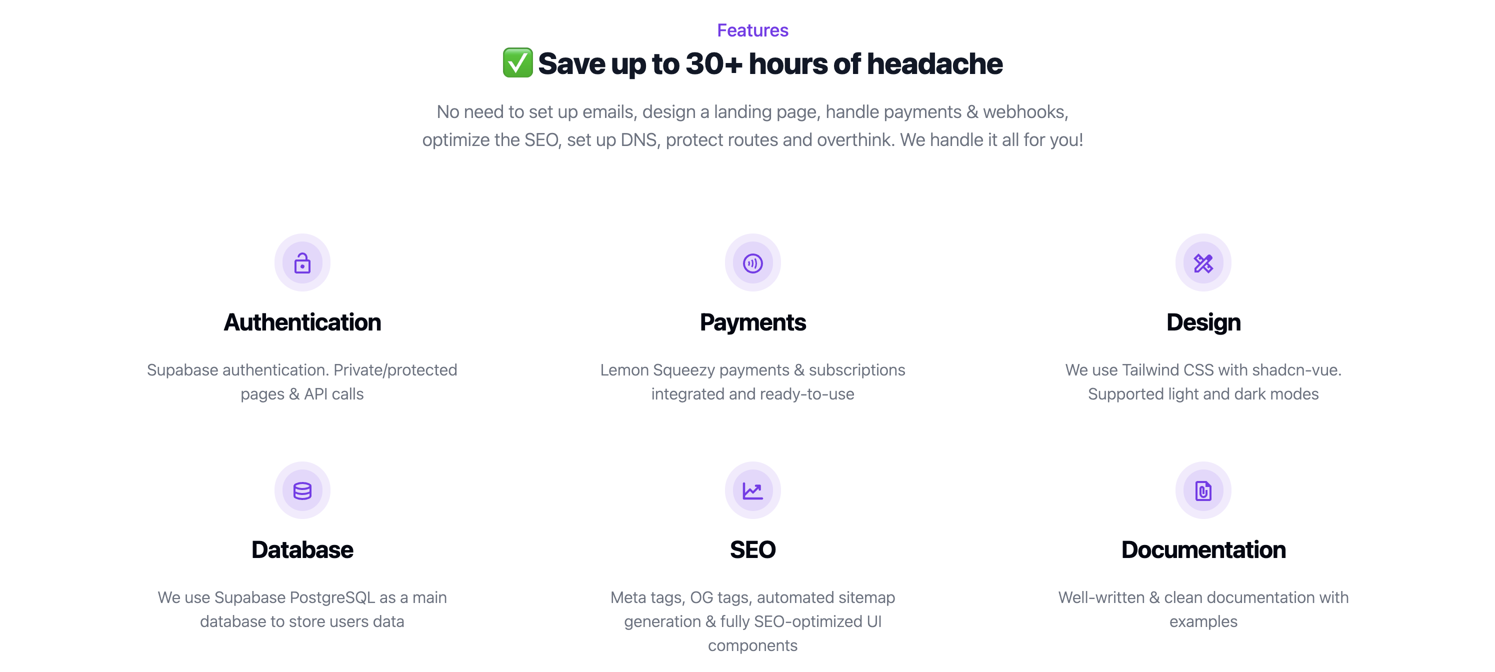
The LandingFeatures component is designed to showcase a set of features in a grid layout. It includes an optional tagline, heading, and description for context. Each feature is displayed within a card, which includes an icon, title, and description.
import LandingFeatures from '@/components/blocks/landing/landing-features/LandingFeatures.vue';
Props
The LandingFeatures component accepts the following props
Optional Props
- tagline (
string)- Description: A brief tagline that introduces the feature section.
- heading (
string)- Description: The main heading for the feature section.
- description (
string)- Description: A subheading that provides additional context for the features presented.
- features (Array of
FeaturesProps)- Description: An array of feature items to display in the grid. Each item includes an icon, heading, and description.