LandingHero
Overview
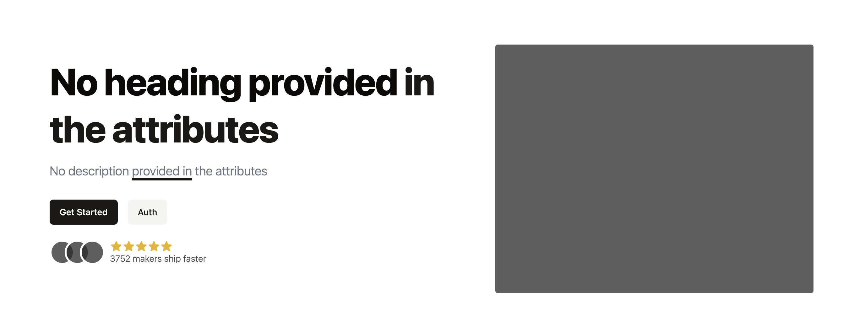
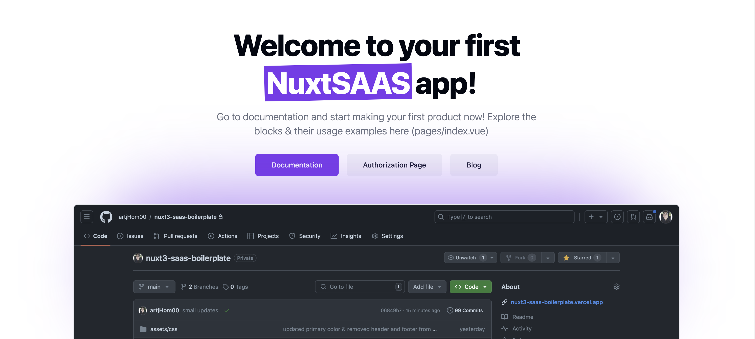
The LandingHero component is designed for the main section of a landing page, displaying a prominent heading, description, image, and optional buttons and testimonials.
import LandingHero from '@/components/blocks/landing/landing-hero/LandingHero.vue';
Props
The LandingHero component accepts the following props.
Note: you can use *Text* markdown for text styling in
headinganddescriptionproperties
Optional Props
- badge (
object)- Description: Badge before the heading
- Properties:
- tag (
string)- Description: badge's tag (optional),
- content (
string)
- tag (
- heading (
object)- Description: The main heading of the hero section.
- Properties:
- title (
string)- Description: The title of the heading.
- styling (
number)- Description: A styling of formatted heading
- Default: 1
- title (
- description (
object)- Description: A descriptive text that accompanies the heading.
- Properties:
- title (
string)- Description: The title of the description.
- styling (
number)- Description: A styling of formatted heading
- Default: 1
- title (
- image (
ImageProps)- Description: Image displayed in the hero section.
- buttons (Array
ButtonProps)- Description: An array of buttons to display below the heading and description.
- alreadyUsing (
object)- Description: Displays user testimonials with images and optional star ratings.
- Properties:
- images (Array of
ImageProps)- Description: Avatars of people, who've used the service
- showStars (
boolean)- Description: Either show or not show 5-stars
- description (
string)- Description: Small description
- images (Array of
- align (
'left'|'center')- Description: Alignment of the content in the hero section.
- Default:
'left'